Litter Intelligence Part 2: Exposing the data
The Problem
For background see Part 1: Collecting the data →
With the data collecting problem well on its way to being solved, it was time to work out how we could put that data to work.
It was clear we would need a website to act as a central point for the entire Litter Intelligence project. The website would not only expose the data but would also provide a platform to present insights and actions that aim to solve the marine litter problem.
The main goal of the website was to present the data in an engaging way. We wanted to give community groups instant access to the data they had collected, provide an educational resource, and allow people to find stories in the data that could be used to inform government policy making.
The following is a high-level overview of the design work conducted during the second half of this project.
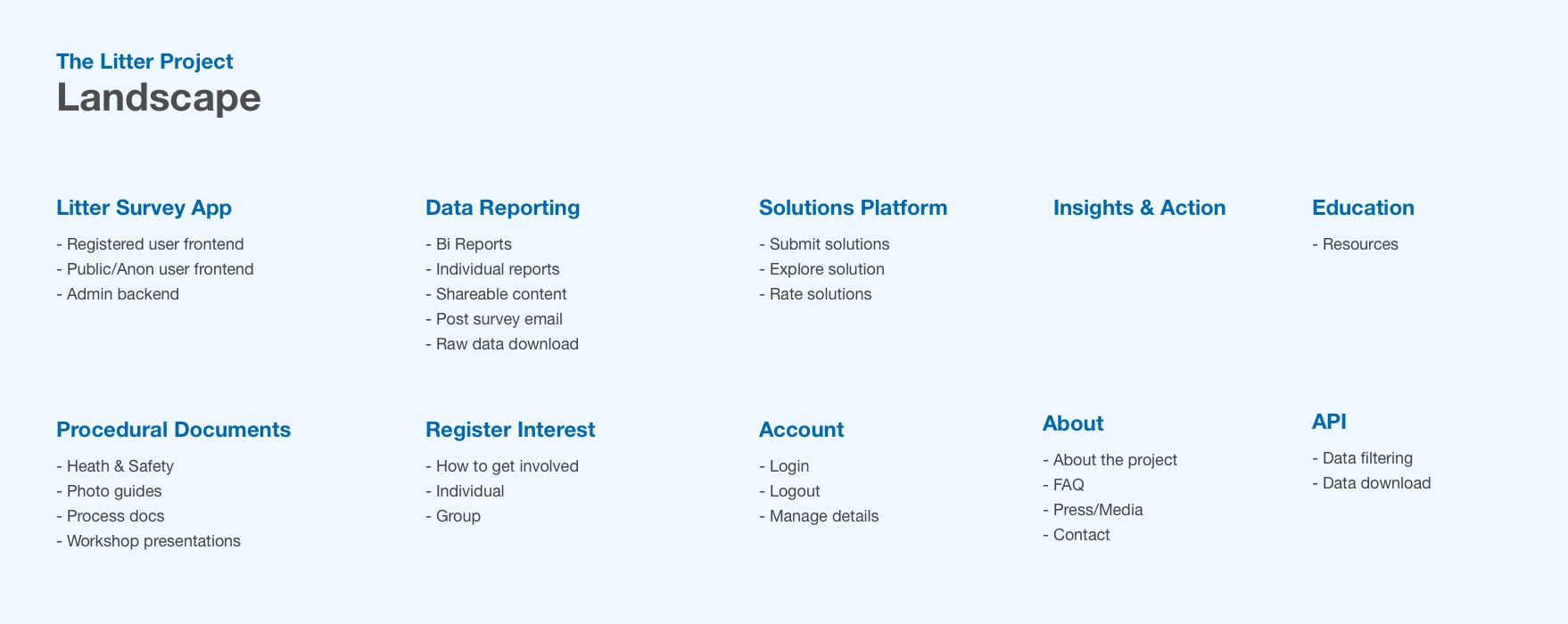
With the general landscape mapped out we began addressing the biggest challenge. Making the data engaging and accessible.
With the help of the Data Visualisation team at Enlighten we produced some initial proof of concept Power Bi reports. These were a great tool to take to the Citizen Scientists and gather feedback. We found one of the issues with the Bi reports was usability, there was too much going on for non-power users. We needed a simpler way to explore the data.
Another challenge we faced was the limited historical data. Although a lot of data had been collected, it was very recent. This meant exposing any trends wouldn't be possible in the first year or so.
Knowing we wanted to keep things visual and easy to follow, we settled on a timeline and map based approach.
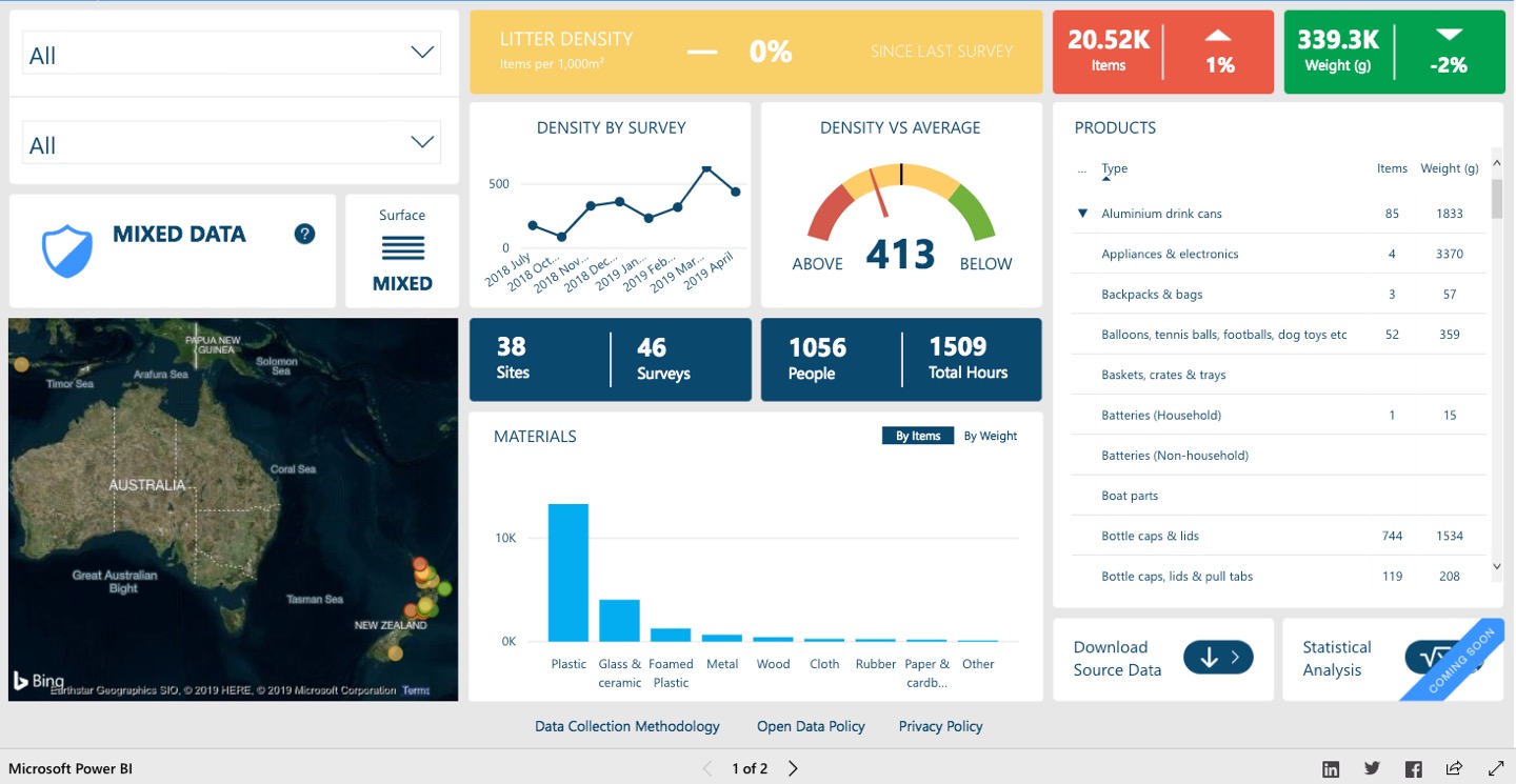 Early prototype of the Power Bi report.
 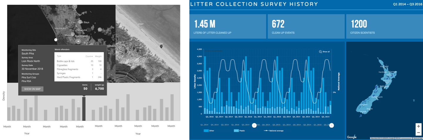 Early timeline concepts.
 Confident with the timeline approach we continued on with the rest of the website.
We needed to find ways to house a variety of content that could be easily explored. This included the individual collection reports, actions to address the marine litter problem, and supporting content that explained the project.
Again we started with sketching out ideas, developing wireframes and clickable prototypes, and testing the ideas with users. Once we were happy with the direction we applied some Sustainable Coastlines branding, ensuring the early releases looked good while we waited for the new Litter Intelligence brand to be developed.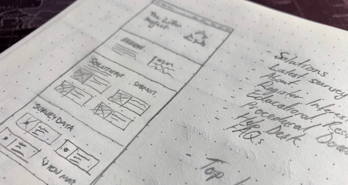 Website wireframe sketches.
 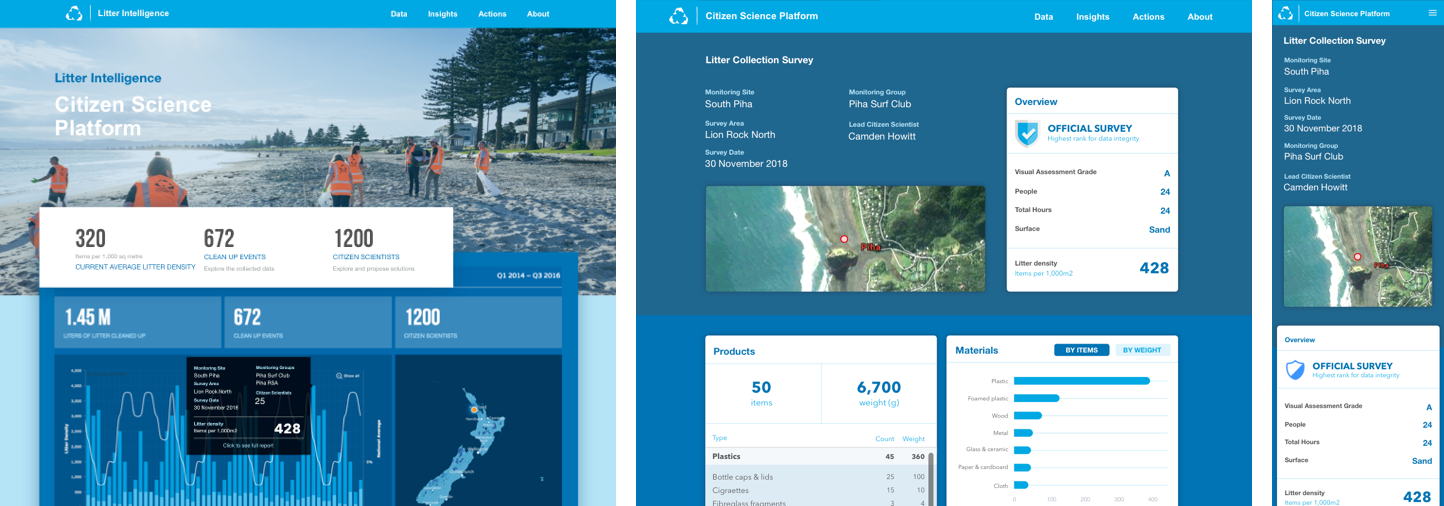 Early design concepts.
 The first round of branding that came through was not quite fit for purpose. Although the colours and designs looked good in print, when applied to the screen they didn't translate so well. Colours were too vivid, and the overall aesthetic was a bit harsh on the eye.
This meant it was back to the drawing board for the branding agency. Once the updated brand came in we were able to a quick re-skin. Which in the end it was well worth the effort.
 Early branding applied.
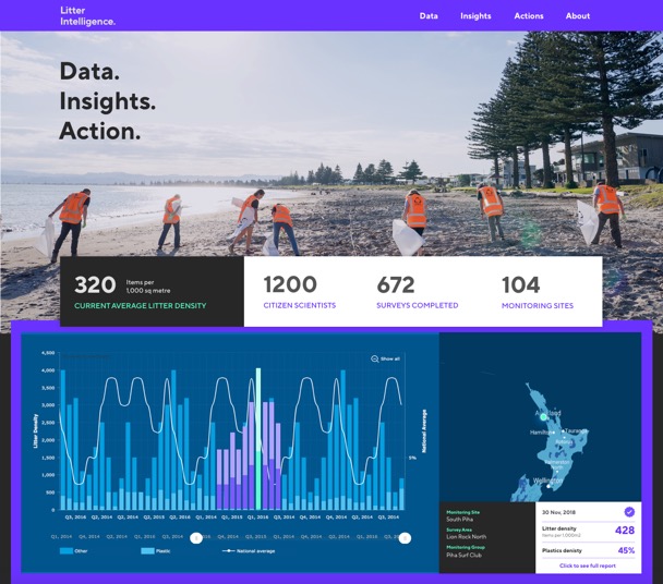
 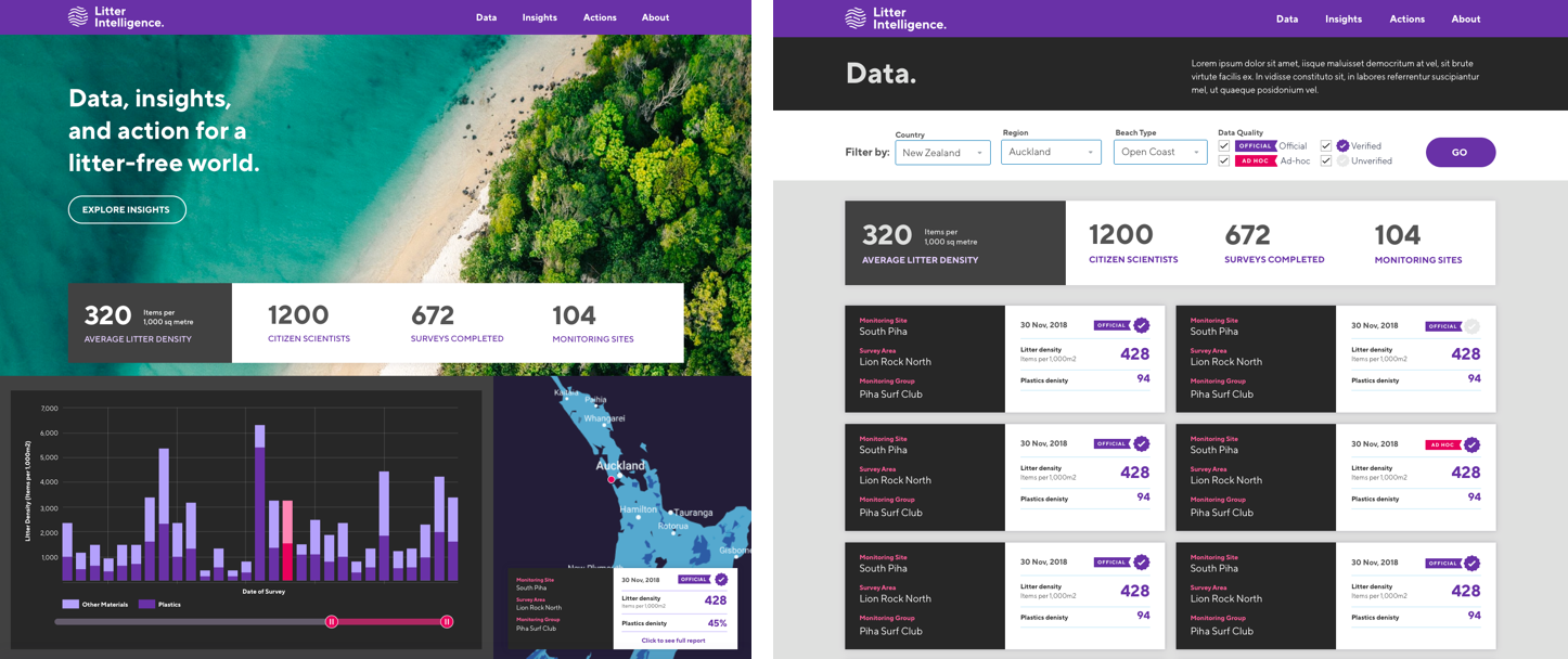 Final website designs.
 The story isn't over yet, as we continue to work closely with Sustainable Coastlines to further develop the data insight reports.
While there is development work in progress, the design is complete and to date has involved various stakeholder interviews representing Stats NZ, media, local community, scientists, and schools. The challenge lay in how to represent the data in a way that serves all these different people needs without limiting potential power users.
Check back in the future to see the new reports in action once the build is complete.
Visit litterintelligence.org →
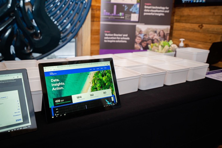 Up and running at the launch event in late 2019.
 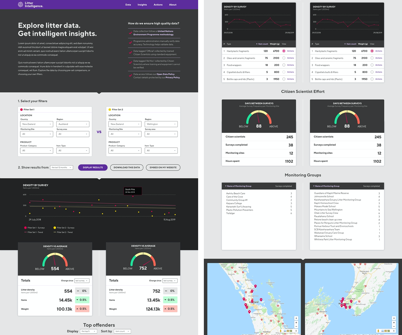 New data insights report currently in development.

