
The Earliest Data Visualisations
We might think of data visualisations as being relatively new developments, but psychology professor Michael Friendly from York University argued in his paper on the topic that they have a much longer history. According to Professor Friendly, the data visualisations of today are actually connected to the earliest maps; those representations of land were a way to graphically display what a city or country looked like.
Data Visualisations until the 19th Century
Over time, the need for data visualisations grew. Early scientists who wanted to understand more about humans, animals, and our universe needed to represent what they learned through images.
Professor Friendly pointed to two other factors that influenced data visualisations’ development:
- The evolution of urban planning
- The need to gain a deeper understanding of commerce
As the years passed, humans created better technologies for drawing and reproducing images. The fields of math and statistics also advanced further, as did data collection, empirical observation, and data recording.
Data Visualisations from the 19th Century until the 20th Century
The 19th century saw the creation of the data visualisations we know and love today:
- Bar charts
- Pie charts
- Histograms
- Line graphs
- Time-series plots
- Contour plots
- Scatter plots
Scientists, especially those who studied societies, began using data visualisations in their work to support their theories. By the end of the 19th century, data visualisation creators began playing around with new ways to depict information visually, leading to what Professor Friendly and other historians call ‘the Golden Age of Graphics.’
Data Visualisations from the 20th Century until Today
For a period of time, there weren’t any innovations in the field of data visualisations. At the same time, statistical graphs became mainstream. Professor Friendly noted that the field was waiting for new ideas and technology, which came towards the middle and end of the 20th century.
Between the 1970s and now, a number of technological advancements have made high-definition, interactive, and dynamic data visualisations possible. Moreover, it’s easier than ever before to create them.
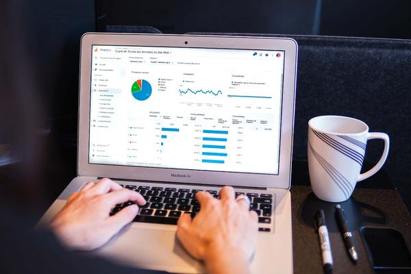
Data Visualisations Today: More than Just Pie Charts
Today, you could create a pie chart. Yet, it’s possible to do so much more—thanks to advances in technology, your numbers can make a deeper impact thanks to eye-catching data visualisations. Moreover, these visualisations are tied to your data analytics, so when the information source is updated, so are your visualisations.
Let’s say that you’re responsible for preparing a presentation every quarter on sales. With today’s data visualisation software, you could create a bar chart that allows you to slice and filter during the presentation itself so that you could answer any questions that decision makers have about the data analytics. The next time you have to give the presentation, the information would be updated because of the connection between the data visualisation and the data repository.
A Real-Life Example of Data Visualisations at Work
In 2017, Enlighten Designs began working with Microsoft to support its Data Journalism programme. This programme helps journalists and news organisations with using Power BI to create data-driven stories featuring interactive visualisations. As Microsoft's partner, Enlighten led a hands-on lab for journalists to learn how to use Power BI effectively in their storytelling efforts.
Since then, Enlighten has worked with American news organisations to incorporate Power BI into how they cover the breaking stories. Enlighten assisted the Associated Press in the spring of 2017 to create an interactive map of voting patterns in the state of Virginia. The visualisation was connected to real-time voting results, so as votes were counted, the visualisation would update.
“Enlighten Designs supports Microsoft’s Data Journalism programme, which helps journalists create data-driven stories.”
Enlighten designed the data visualisations so they could be tailored for the news outlets that subscribe to the Associated Press. The customised visualisations showed audiences across the US the voting patterns in their communities.
What Is the Future of Data Visualisations?
What does the future hold for data visualisations (and by extension, data analytics)? While predictions about the future aren’t always accurate, there are some very interesting forecasts that we think are worth sharing.
The first prediction is that learning how to create data visualisations will not just be something people learn how to do on the job anymore. Universities and other post-secondary training institutions will start offering courses in creating data visualisations to ensure that their students are ready to meet employers’ needs. As visualisations grow more sophisticated, organisations will need more people to create and interpret them.
“Our prediction is that universities will begin offering data visualisation courses to keep up with employers’ demands.”
The second prediction is that data visualisations will integrate with virtual reality and augmented reality (‘virtual reality’ creates an immersive, interactive virtual environment; ‘augmented reality’ is an enhanced real-world environment with computer-generated information about objects). You could someday put on a headset, a pair of glasses, or open up an app that allows you to explore data sets even deeper, or use smart mapping capabilities to give you a better understanding of a data set.
A third prediction centres on mobility and data visualisations. While Power BI already works well on mobile devices, we’ll see more users creating and consuming visualisations on smartphones and tablets because they’re becoming an ingrained part of enterprise technology.
Enlighten Designs: Helping You Bring Data Visualisations to Life
Since 1998, Enlighten Designs has been creating amazing digital experiences for its customers, including data visualisations. Our expertise and experience in data and producing eye-catching graphics, as well as our partnership with Microsoft, enables us to deliver stunning data visualisation capabilities to our clients. To learn more, contact us.